Beautiful map! Exceeded my expectations. Would definitely recommend to others.

We love having this in our office, showing exactly where our remote assistant works from!
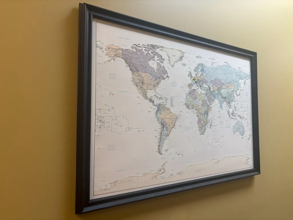

Poster looks fantastic in the new home office. Great quality and great customer service! 10/10 would recommend!

Wow! Love the artwork so much. Great quality. Thank you!

Great quality, excellent customer service. I ordered on short notice for my wife’s birthday, and was delivered just in time. She loves it. Thx!

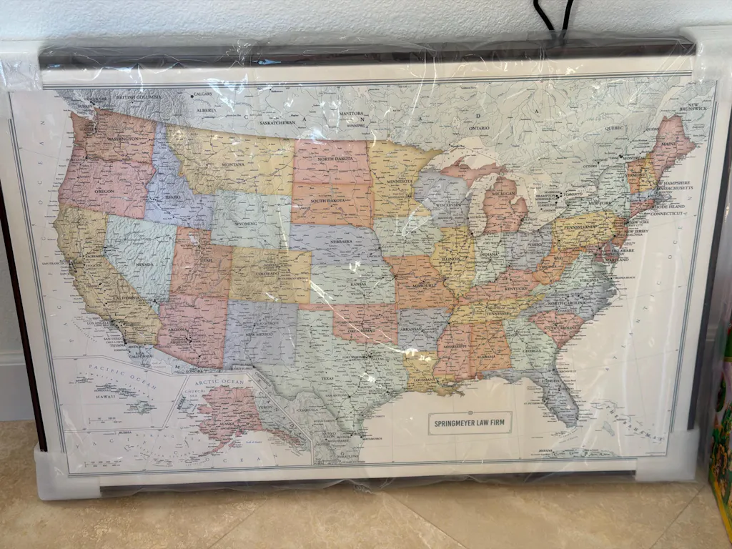
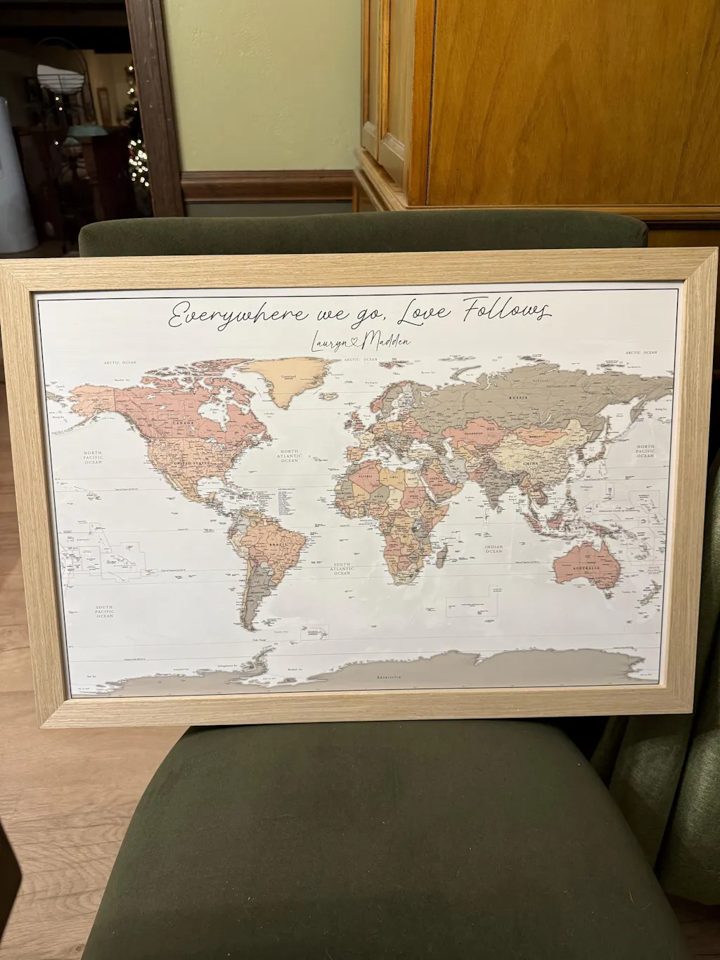
The item was supposed to be personalized. It was just a plain map that was sent, which I could have ordered from anywhere for $20. I really don’t understand.


The piece is exactly what I was expecting. The quality is amazing and it came so fast! The perfect gift for a loved one or yourself. Frames really nicely!
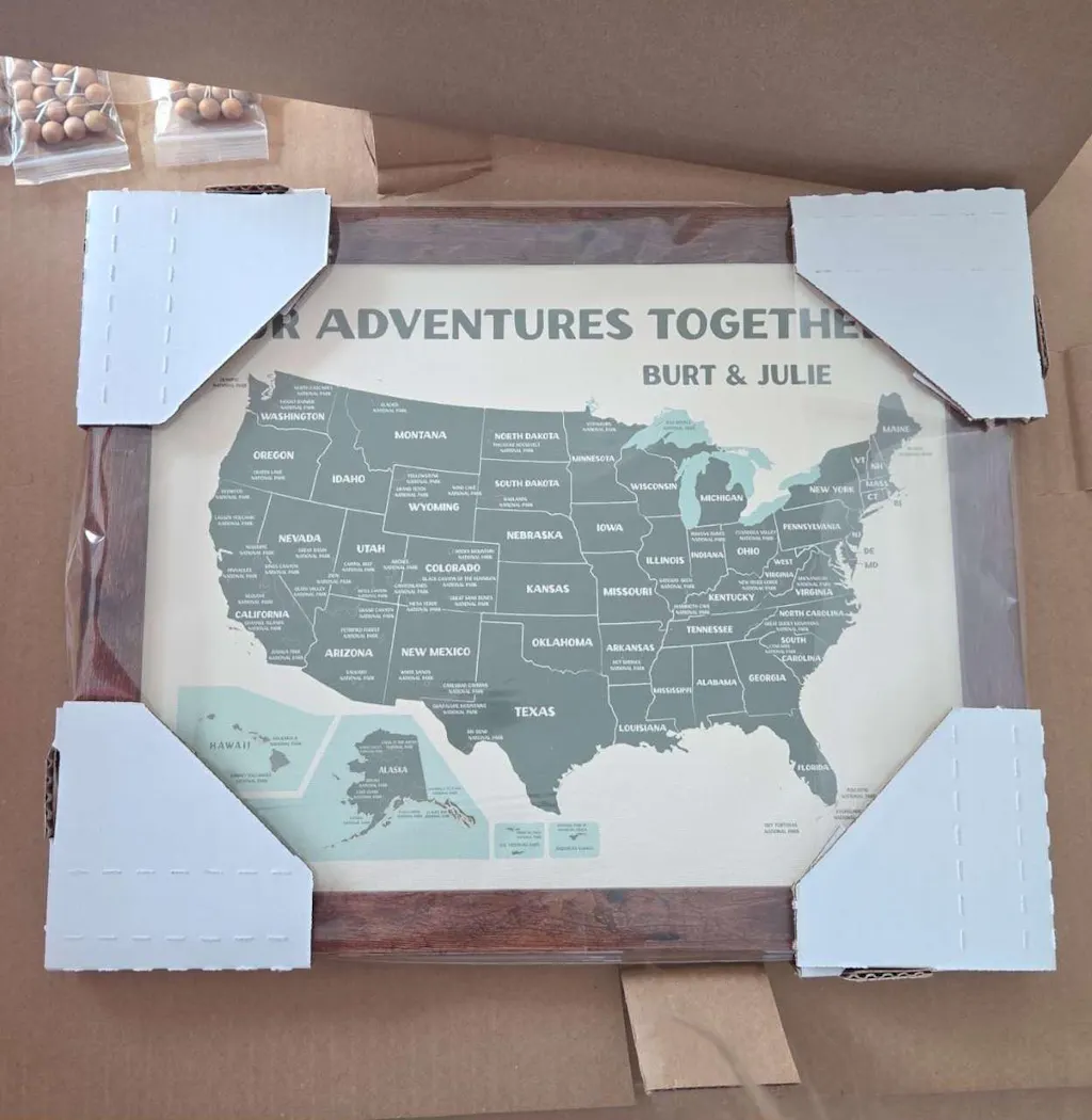
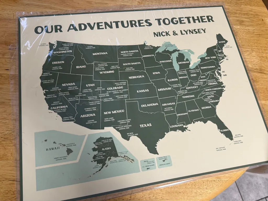
I was sent a proof in less than 24 hours. They were very prompt. It was packaged very well for shipping. Highly recommend if you are looking for a nice map for the USA.
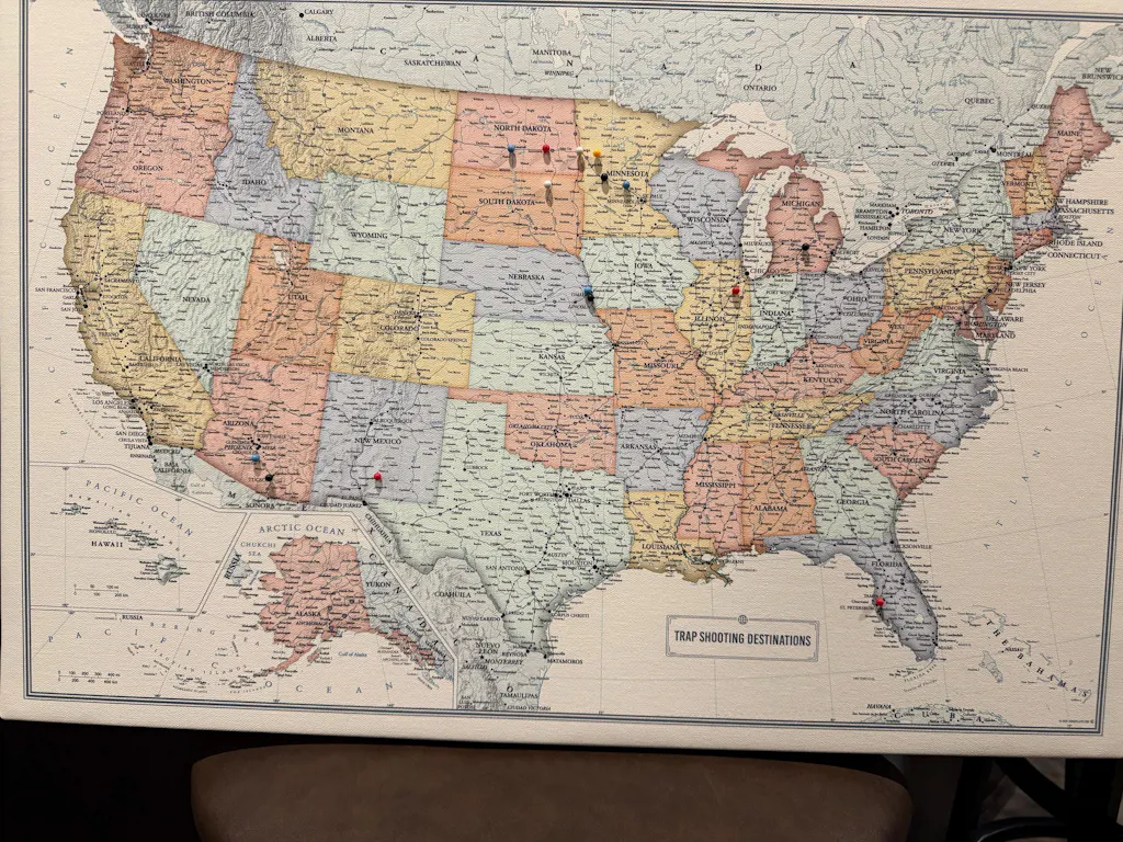

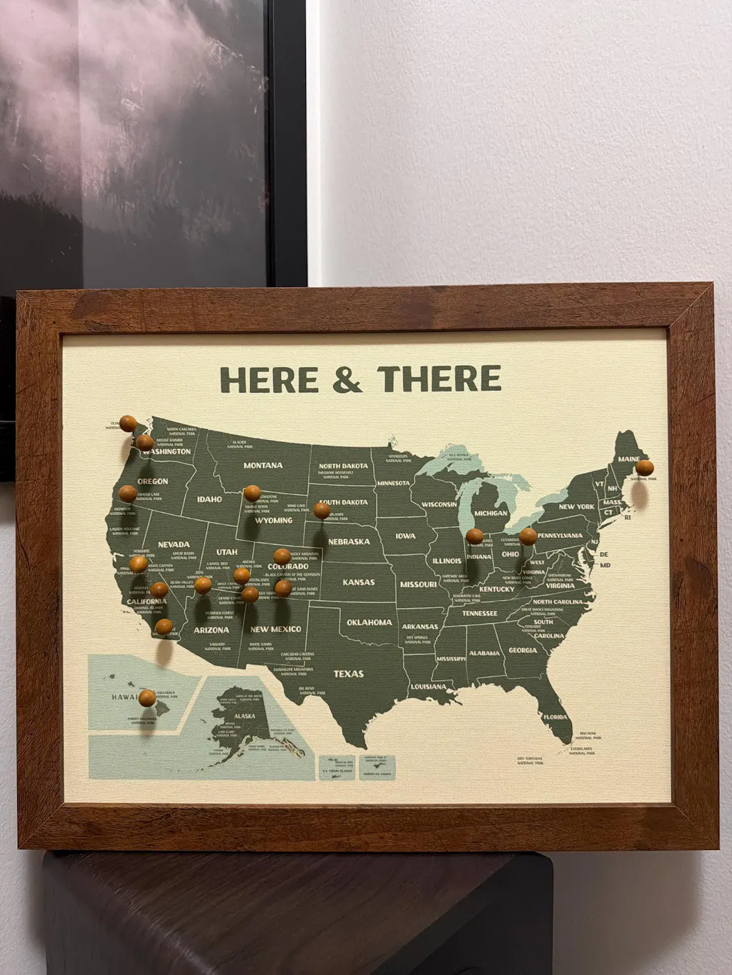
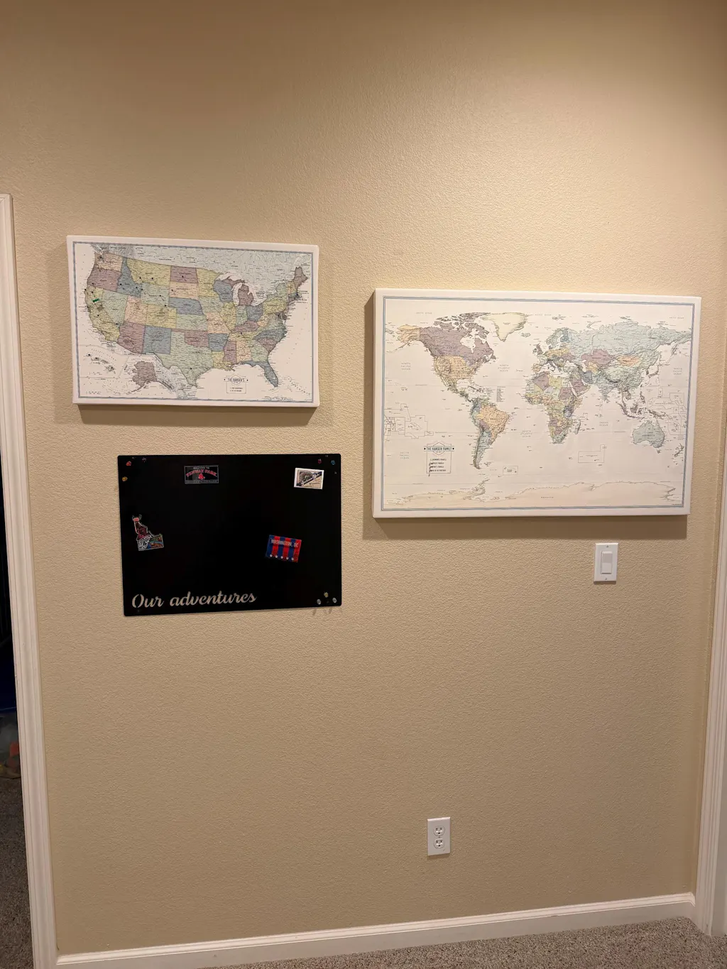
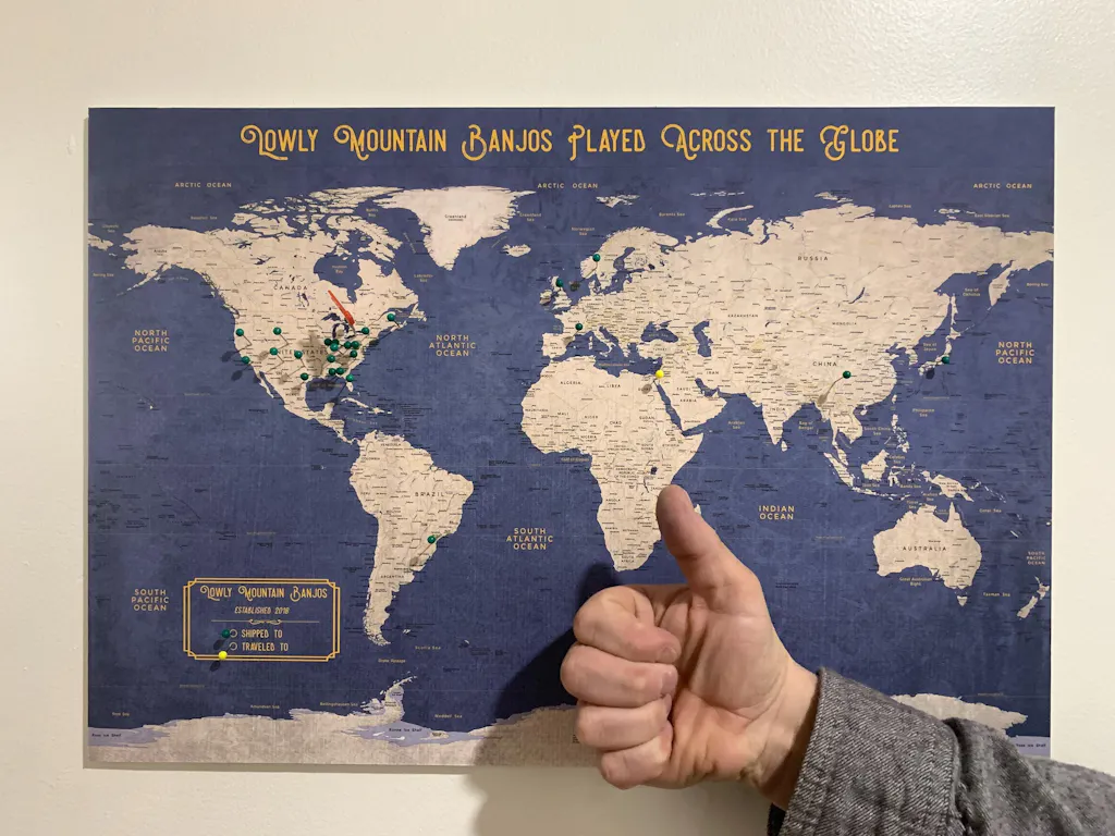
The map was beautiful and looked exactly as the pictures and as described! It came with the pushpins as well. The shipping was also VERY quick! I received my map less than a week later.

The map we ordered turned out amazing. Great quality, quick shipping and great service!
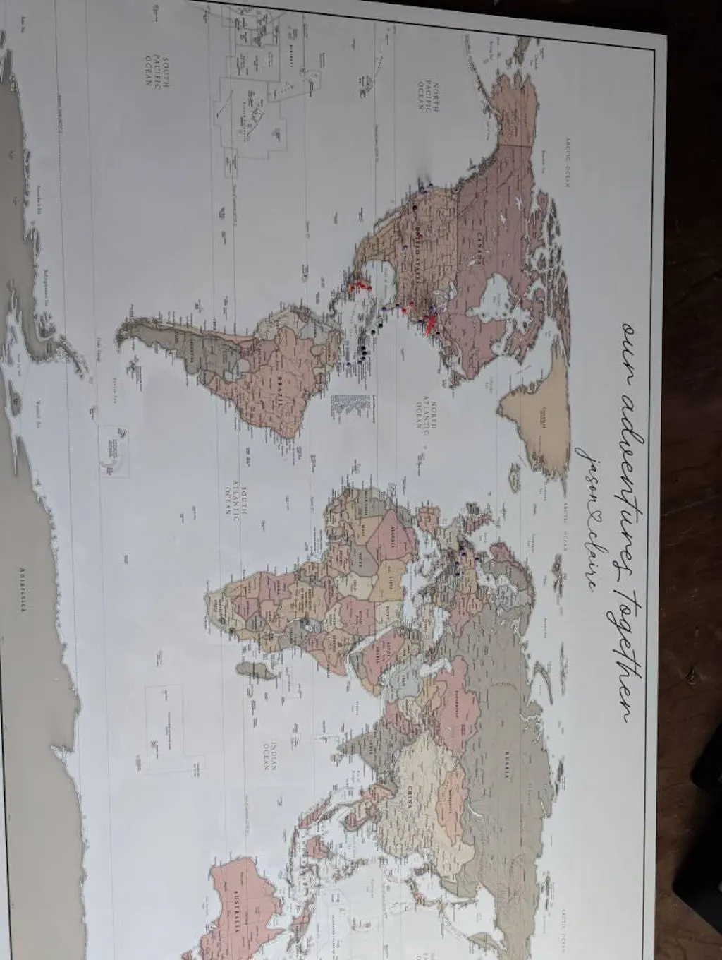
I can't believe how fast this shipped, 6 days in total from purchase date! I also wanted to mention how WELL it was packaged, everything was padded and stapled/taped down. Megan sent me a proof very quickly to make sure I was happy with my customization. I can't wait to give this as a gift, he is going to love it!
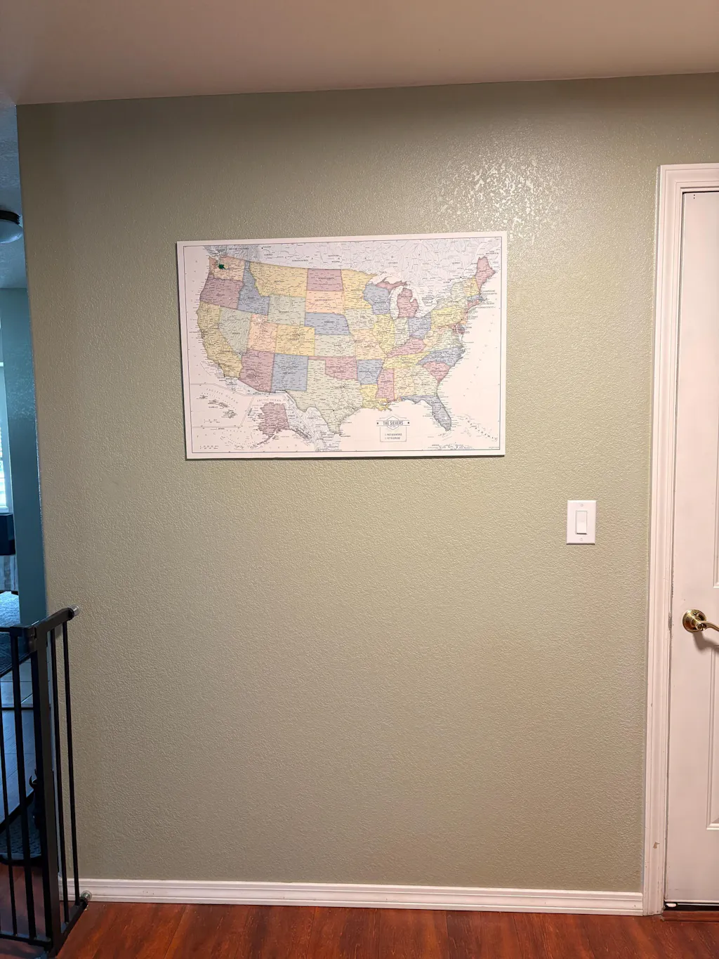
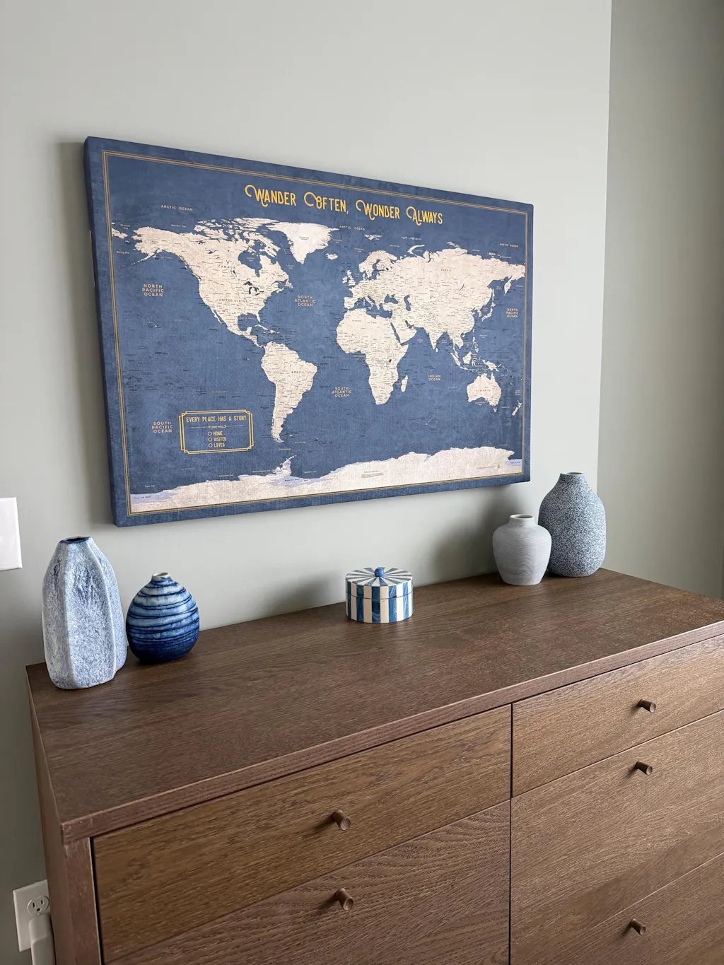
Love it!! Took a risk on the colors matching my accent wall, and it works perfectly. Fast shipping, great communication, 5 stars all around. Thanks so much!!
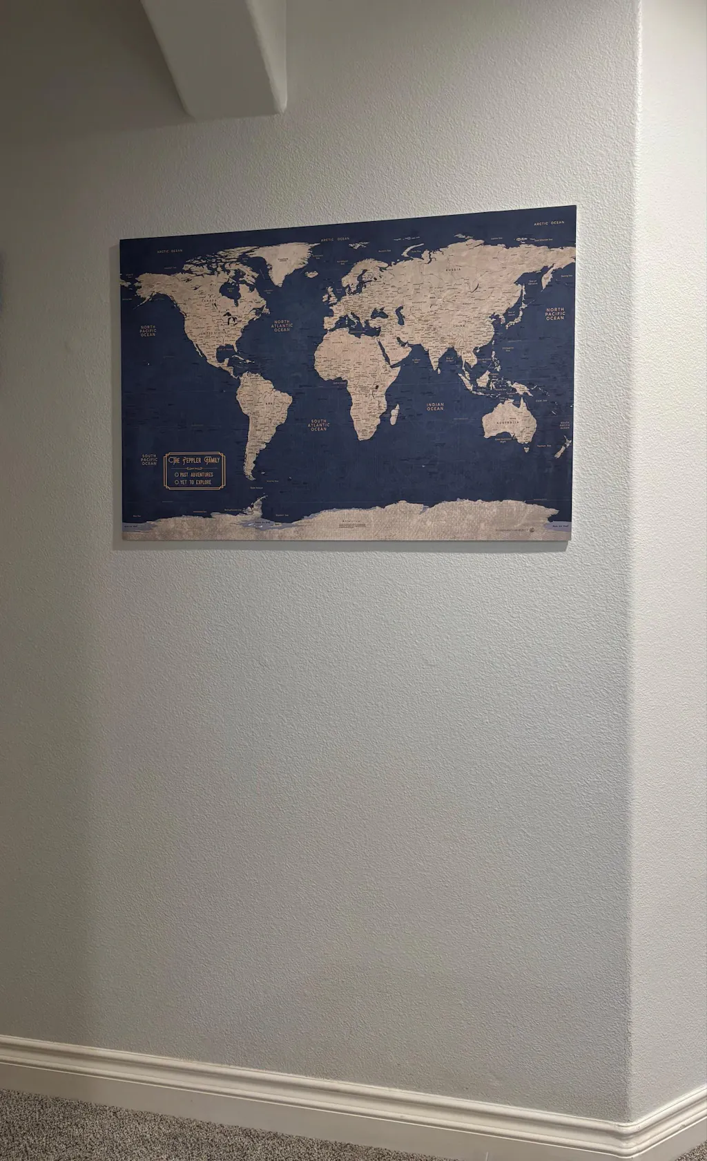
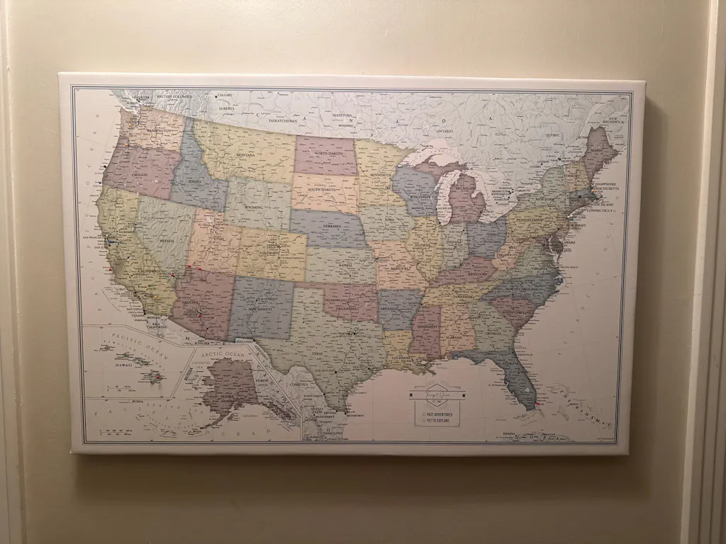
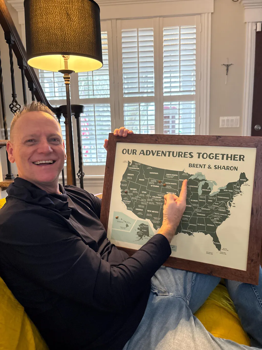
Kevin was prompt and courteous. He was responsive and answered all the questions I had about ordering. The map is great. I bought the smaller map because it fit my budget and fits in our loving room but I'd get the larger size if I wanted to have this more prominently displayed. This was a gift and a great surprise! I ordered it last minute before Christmas and it was made and shipped so promptly it arrived just in time. Thanks again!

Absolutely LOVED this map!! The seller was quick to respond and nice enough to customize for my request. Would recommend to anyone! Can’t wait to hang it on our wall.
Perfect map! It was packaged very well and arrived quick. Thank you!
Thank you map was a great birthday gift for my husband great quality and fast shipping.


the map is exactly what I was looking for as a Christmas present for my husband! exceeded all of my expectations & it's a great quality push pin board
Looks beautiful! We Love
It. It arrived very fast!
Seller great at responding, product is quality and shipping is safe and secure!
This is the second time ordering (ordered two this time)! Seller is super easy to work with!
The order was completed quickly and I got to proof it before it was completed. Turned out great!

Everything was great!
She did what I wanted.
Great communication,
Great product!
A little pricey but worth it I think for the quality of the product. I’m excited to gift this at Christmas! They’re huge travelers and I know they’ll love it.

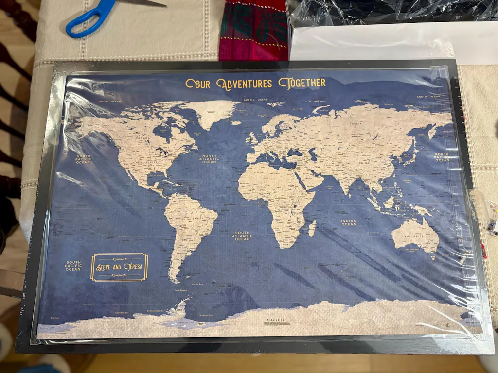
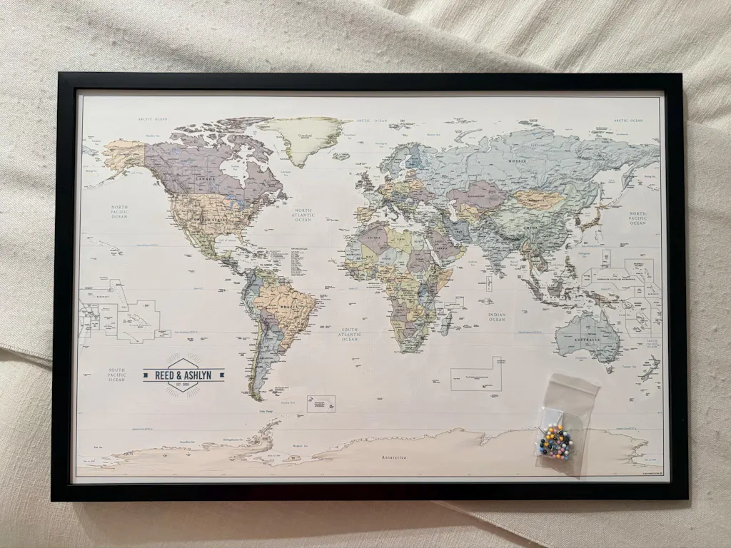
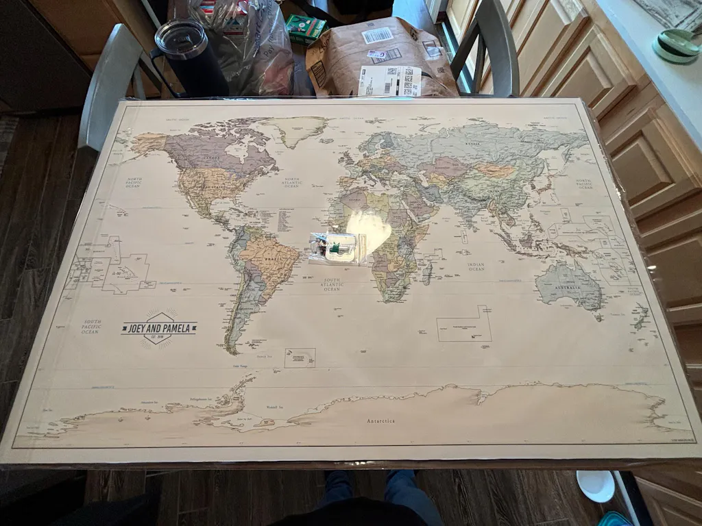
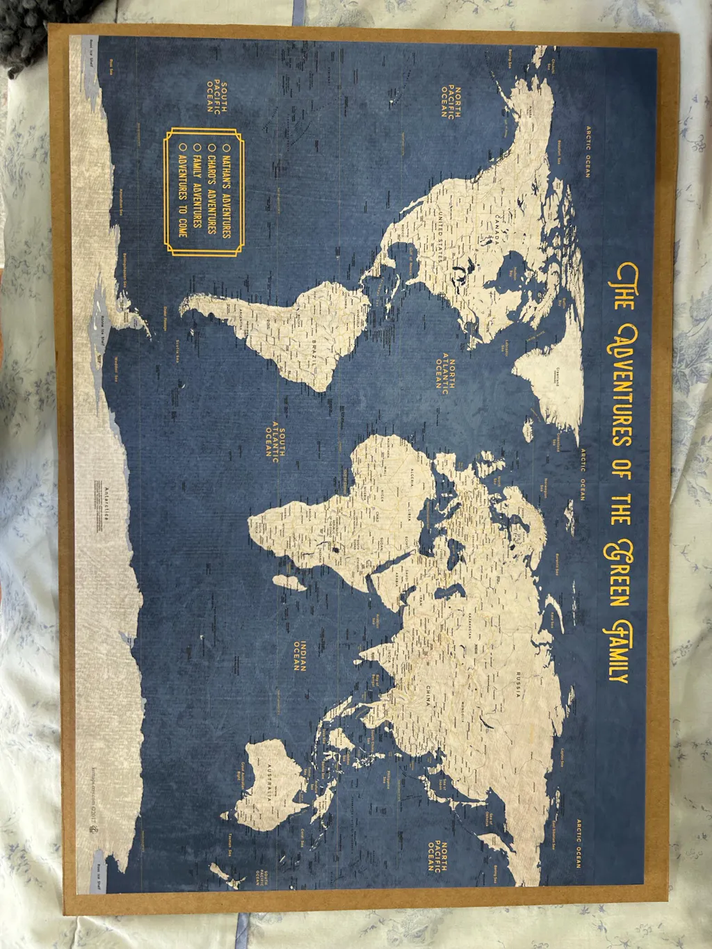
Seller contacted me to approve proof before creating! Item was beautiful and perfect as described. The pic is showing it still in packaging and on top of poster frame I ordered to go with it. I am very pleased with this ! Also it came with push pins!